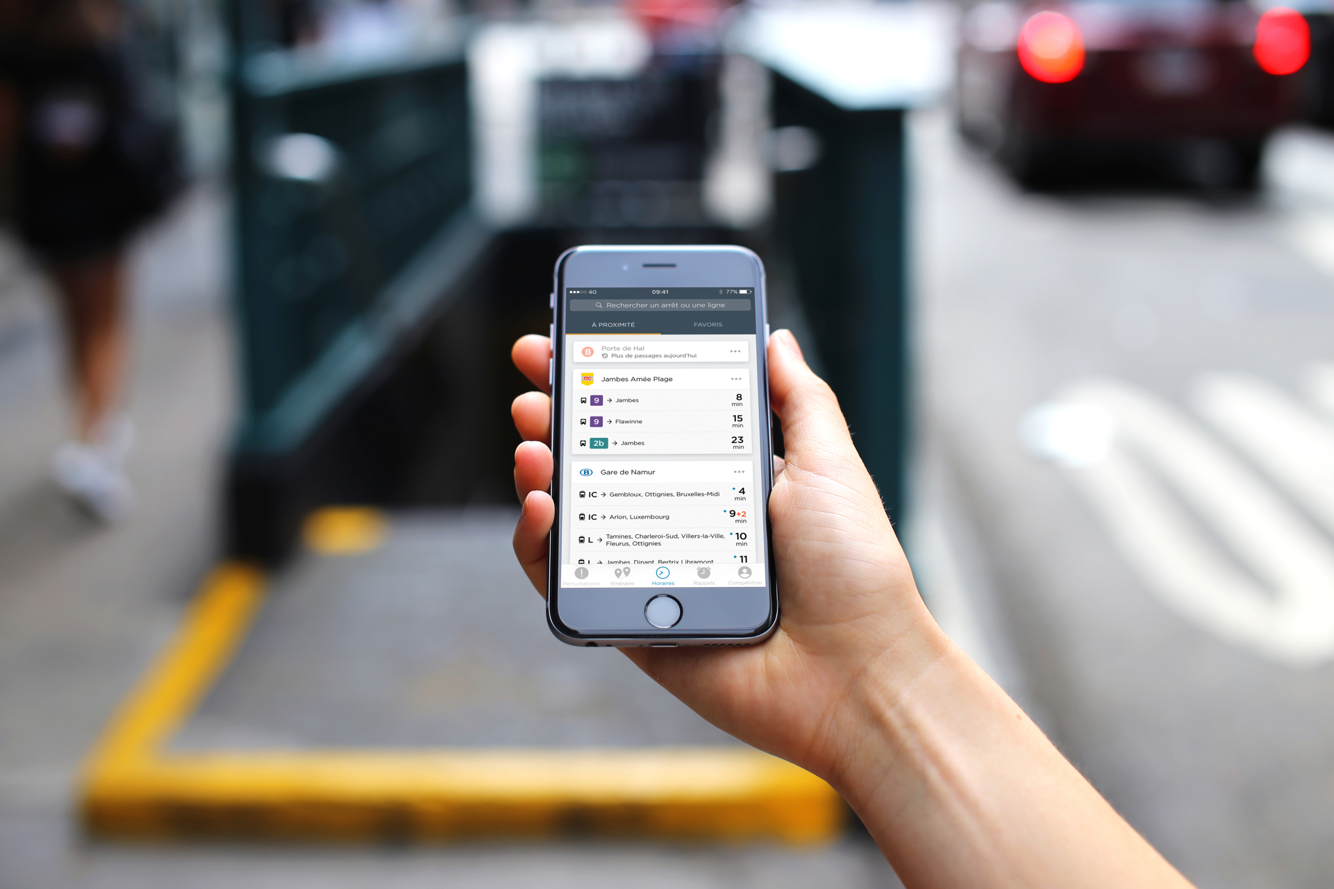
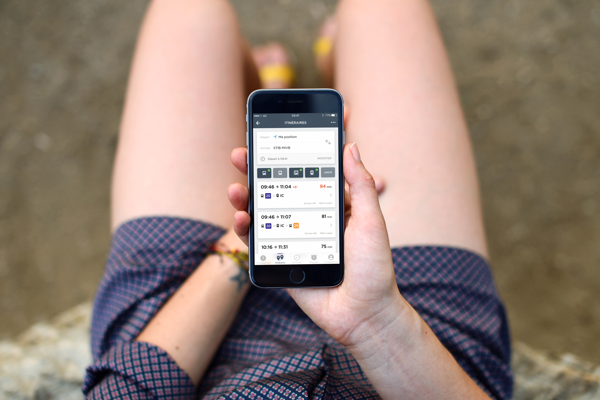
Common basics
There are more than 1.4 billion passenger rides on a single year in Belgium, a country which only counts about 12 million citizens. This gives you an overview of how important public transport is here.
Commuting via public transit is just so common you must think the traveling experience is a breeze – it's not, mind you. But commuters and unfrequent travelers seem to just have accepted this fact.
Let me offer you an overview of an everyday mess: general information scattered around multiple non-mobile websites, old PDFs, printed timetables that are not reprinted frequently, etc…
This is where NextRide comes in to improve your everyday, or occasional life.
Launch website
Information for everyone
NextRide is not just an app, but more of a passenger information system available through many platforms, for everyone and for free. The infrastructure relies on a few web servers feeding the app for iPhone, Android & Windows Phone, the web app, public information displays, and partner APIs.
But NextRide is not just giving information. It gathers a lot of information which is then used to process simulations employed by different authorities.
Different cooperations made with NextRide, whether with transit authorities, whether with non-profit organisations, enabled fast progress among open public data.
Actively working on facilitating access to public information for everyone is one of our main goals.
Welcome on board
At early stages, NextRide only provided timetables for selected routes that were manually written in a database.
But it rapidly grow, integrating new useful features, such as a 'Leave Reminder', a multimodal trip planner, real time integrations, etc. Some of the current features were suggested by our user base.
Oh and what an user base. NextRide is used everyday by more than 60K users, which are among our 360K+ active users.
I never met such a high quantity of people using a product I crafted, along with three friends. A lot of these users rely on our optimized app to move around because of a disability.
Product design at NextRide revolves around being simple and easy to use. It is not only pleasant to look at, but also pleasant for visually impaired people, because we strive for accessibility.

Design for mass
'Mass' is not a way of bragging. It just is what's composing the core of NextRide users, ranging from 10 to 87 years old (as far as we know).
Early versions were designed by my own taste, and current trends I guess. I quickly realized how this was not going to be suitable for long term. With the team, we led a massive survey accross volonteer users, trying to see what had to change for the better.
Although we already received a lot of feedback, I went on and proceeded with a real life A/B testing. We picked random users at random bus stops and asked them to use the current app and be recorded with the front-facing camera. Thanks to this, it quickly became clear where UX issues were present.
Another concern is that three languages are official here in Belgium, and many others are spoken. Although being able to speak French, Dutch and English, I didn't know much of any of the others. But design is also dependent of language and copy. This is why I chose to prioritize clear icons for easy communication, and brief but friendly copy when necessary.
There are so many things, so many details, so many aspects of this start-up that I'm proud of. So much that I'm not able to write it all out. I can't wait to share what's coming next with you.